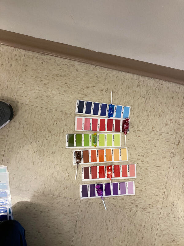
 1. Was it easy or hard to decipher the colors and why?
It was hard to match the candy to the pantone colors because there are many similar shades of that colors on the pantone scale and the differences were so small it was kind of difficult to match them exactly. 2. How does the Pantone System improve design and printing? The Pantone System improves design and printing because when the designers design a specific piece with certain color sets in mind, the Pantone System acts like a common medium that designers are able to communicate to printers so that the final distributed version is as close as possible to what the designer envisioned it to be. 3. When would be a good time to use Pantone colors in this class? A good time to use Pantone colors in this class would be during collaborative projects. Just like how designers and printers use this as a common ground when talking about color, we can use the Pantone System in this class while collaborating with others so that we are thinking of similar things when we are talking about color. It can be a lot more efficient to talk about Pantone colors rather than overarching color statement such as "red".
0 Comments
Leave a Reply. |
Divyansh Jain
|
 RSS Feed
