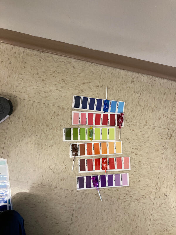
 1. Was it easy or hard to decipher the colors and why?
It was hard to match the candy to the pantone colors because there are many similar shades of that colors on the pantone scale and the differences were so small it was kind of difficult to match them exactly. 2. How does the Pantone System improve design and printing? The Pantone System improves design and printing because when the designers design a specific piece with certain color sets in mind, the Pantone System acts like a common medium that designers are able to communicate to printers so that the final distributed version is as close as possible to what the designer envisioned it to be. 3. When would be a good time to use Pantone colors in this class? A good time to use Pantone colors in this class would be during collaborative projects. Just like how designers and printers use this as a common ground when talking about color, we can use the Pantone System in this class while collaborating with others so that we are thinking of similar things when we are talking about color. It can be a lot more efficient to talk about Pantone colors rather than overarching color statement such as "red".
0 Comments
 1. What is the principle you are animating?
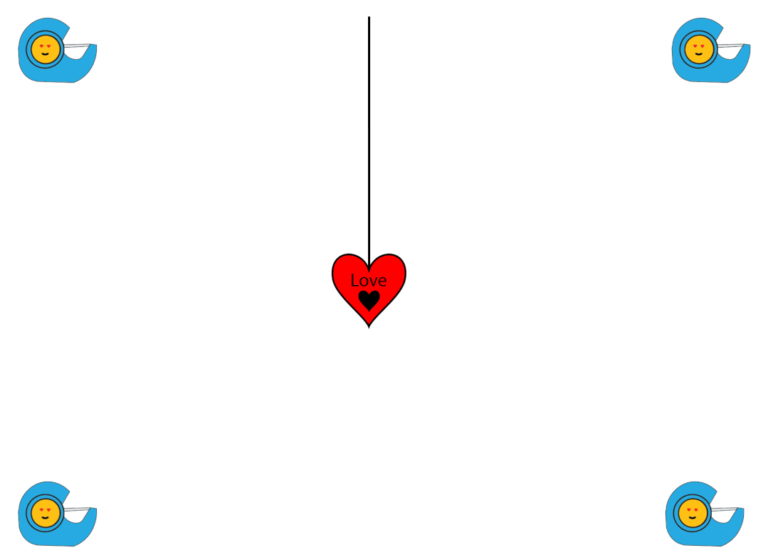
The principle I am animating is Arcs. As you can see, my heart locket is swinging in an arc instead of straight which gives it a more realistic feel. 2. Was it easy or difficult to use puppet warp & why? I found it really difficult to use puppet warp because of the drag and drop and also the amount of precision which is required to use the tool. I used the tool really scarcely. I played around with angles and x and y displacements more to achieve my animation 3. What do you like about your animation? I like the uniformity of the pendulum movement. It move at 5 degree angles up to 25 degrees before falling back down. The mathematical nature of the pendulum gives it a satisfying feeling 4. What would you change about your animation? One thing I would change about my animation is to make my emoji a more central part of my animation. Right now it just sits on the side, setting the environment rather than being the main part of the animation. I tried a couple of things, like making the emoji the pendant, putting the emoji inside of the pendant, but none of these options really looked good. Since I couldn't find a good way to use my emoji in my central animation, I just used it to set the scene, and take a backseat to the actual pendant swinging animation. 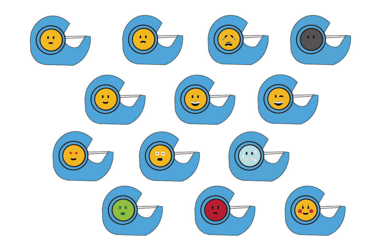 Project ResponseIt was a little hard to use my obstruction because my obstruction was School and Education. It took me a while to come up with an idea which I thought would look good. I decided to use a Scotch Tape box for my theme, and embedding the emoji faces inside of the hole of the box. Because my emoji faces where inside of the Scotch Tape box hole, my proportions and sizings were smaller than the ones in the tutorial. I was successful in being able to follow the tutorial and modifying it to fit my proportions and my requirements to embed into the Scotch Tape hole. One thing that I could have done better is that my crying emoji tears could be aligned better so that it would look more natural. Also, the details of the surprised face emoji are a little fuzzy, and can be improved. Overall, I thought I was pretty successful in making these 13 emojis fit a central theme of School/Education while still having the fun emoji aspect.
|
Divyansh Jain
|
 RSS Feed
